|

By Tim O’Shea
While Sif may be the central focus of writer Kathryn Immonen and artist Valerio Schiti’s JOURNEY INTO MYSTERY, the supporting cast also adds a great deal of adventure and excitement to the Marvel NOW! series.
In our first installment in Schiti’s two-part discussion of his character designs for JOURNEY INTO MYSTERY, he focused on Sif. Today, he delves into his approach for the diverse supporting cast. To add to the mix, Immonen briefly shares how her collaborator brings these characters to life based on hints and references laced throughout her scripts.
JOURNEY INTO MYSTERY #648—the third issue of the creators’ run—goes on sale January 30.
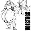
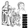
Valerio Schiti: Gudrun is basically a mother; she has a bunch of little children and a bigger one: her husband Volstagg! That’s why for me she’s a hero too, even if it is a different kind. Based on Kathryn’s script, I decided to make her more dignified than before. She’s kind, wise, responsible, and reliable and I tried to represent these qualities. The children are an extension of her character: the more the children are wild the more Gudrun’s kind smile will be heroic! That’s why there are so many terrible kids all around and everyone is different and peculiar; tall, small, fat, thin, cute, ugly, with different ages; average siblings that do what all siblings do, including Sif and Heimdall: usually they fight!
Kathryn Immonen: He brought these characters to life in some really amazing ways. I work really hard to drop the hints and references, to plant the seeds in the script descriptions that open the door for the design process to start and for the story to come to fruition in a way that's satisfying for everyone involved. Valerio and I seem to have some great chemistry that way. And he is just absolutely flying here.
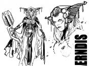
Valerio Schiti: Aerndis is one of my favorite characters. Kathryn asked me to represent her with a staff and headgear worthy of [Jack] Kirby, something mythological I guess. She’s a witch and warrior, a mix that makes her so beautiful in a strange way! My effort was to express her weird beauty, the same kind of charm as Maleficent from “The Sleeping Beauty”—evil but still a bit sexy. Jordie Bellaire’s colors are the final touch; no one could ever forget her shiny green pages that perfectly match with the mood of the character! She’s doing stunning work indeed.
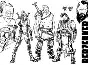
Valerio Schiti: The Berzerkers’ look is inspirited by Jeff Dekal’s cover. His art is amazing so we decided to start from there. In our culture the face tattoos and the face marks are pretty uncommon so it was the fastest way to characterize them as dangerous warriors from another time. They have different clothes, different marks and different bodies since they are not just characters: they’re [people] and every person is different. It’s the same way of thinking that I used for Fandrall, Volstagg, Heimdall and the rest of the cast of our story. Kathryn developed a diverse collection of characters, maybe with small roles but distinctive, so I tried to highlight that variance even with the body language and the facial expressions.
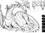
Valerio Schiti: Nidhogg isn’t a new character but his appearances were so rare that we decided to reinvent him. My first design was more like a typical dragon but it wasn’t good; he should be a funnier character. [Editor] Lauren [Sankovitch] and Kathryn asked me to change it into something more relaxed, something that should express the maximum level of gluttony. The lions and the iguanas inspired me for the body but the facial expressions were the touch of class. I really like to draw it and I’ve seen a bunch of Disney’s movies so it wasn’t difficult to make him act!
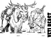
Valerio Schiti: The snow creatures appear in a couple of pages but the impact of that sequence is so strong that I had to do a proper study for their design. The script was pretty clear about some aspects of the characters and I added some details to suggest that they came from a violet kind of culture. They decorate the saddles with the bones of their own dead: ‘nuff said! Kathryn asked for something very big for the mount, so I tried with a giant white tiger, something fierce and noble at the same time. The splash page, with Sif riding the tiger is inspired by Jacques-Louis David’s Napoleon Crossing the Alps. It’s a very epic picture and of course I can’t match against that, the only coolest thing is that Sif is not on a horse, she’s riding a super-giant-fierce-tiger-beast-with-antlers!
Kathryn Immonen: One more thing, we don't always agree: I said Ulysses S. Grant on Cincinnatus and Valerio gets all crazy and pulls out David's painting of Napoleon at the Saint-Bernard Pass. What can you do? [Laughs]
|


